Video Tutorial: How Many Axes Can You Fit on a Chart?
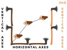
With Combined charts, you can set up a 3rd axis, which allows you to include a surprising amount of complex data in a simple chart. By having 2 vertical axes, we can add an additional dimension to a chart.
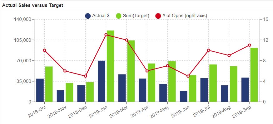
In this example, we have added a secondary vertical axis on the right side and added a red line to show the number of opportunities which corresponds to the right vertical axis.
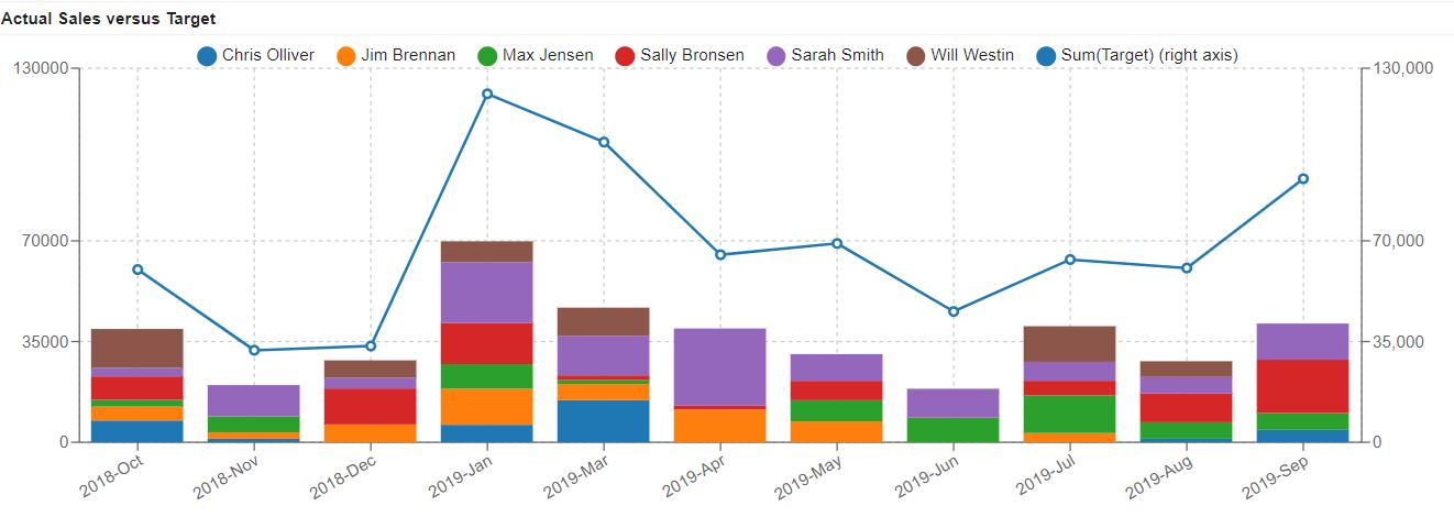
It can also be useful to stack your data. In this chart, we’ve stacked the sales numbers by each sales representative.
Want to learn to set up a combined chart? We’ve made a quick video tutorial to walk you through the two examples listed above.
To see the full playlist of all our tutorials for SuiteCRM and SugarCRM click here.


